Wednesday, May 23, 2012

The Gardner Heist


Prior to living outside of Boston I knew very little about the city and its rich history. Certainly, there were the vague generalities gleaned from junior high American history courses. Most Americans recall phrases like Lexington and Concord, Bunker Hill, the shot heard ‘round the world, and the midnight ride of Paul Revere. I actually did know a bit about the Boston Museum of Fine Arts, but my knowledge of the art scene in the city was lacking. I was mostly aware of the MFA’s collection of John Singleton Copley works which I had discussed while teaching an American Art History course.

Even after I was living in Massachusetts for a year or so I was still unfamiliar with another treasured landmark—the Isabella Stewart Gardner Museum. I had heard from friends and acquaintances that it had a superb collection and that it had been the victim of an infamous art theft, but I had not made the time to visit. So, my first visit was with a friend from the Church of the Advent. I had heard tales about the museum and its namesake from people who worshipped at that church.

I attended the Church of the Advent for three years. At each mass I was entranced by the extensive neo-gothic stone reredos that graces the back wall of the chancel. I was told that Mrs. Gardner had actually gifted that item to the church. She had attended there in the late nineteenth and early twentieth centuries. A rather peculiar individual, Gardner is said to have scrubbed the steps of the chancel by hand—on her knees on Good Friday—as a form of personal penance. Her will stipulated that a requiem mass be said for her there each year around the middle of April. It was possibly these stories of a famous former parishioner that led me to my first visit to the museum.

That visit also led me to eventually pick up the 2009 book—The Gardner Heist—that examines the multifaceted art theft. This remains the most infamous art heist on record and Ulrich Boser provides an enthralling account of the tangled web—or rather, endless cocoon—that surrounds the mystery.

There is something in this book to engage nearly any reader. A reader need not know anything about Mrs. Gardner, her museum, or art in general. Boser initially approached his writing somewhat distant from all these. The reader becomes enveloped in the tale just as the writer became subsumed by the mystery. Boser had never intended to be so personally invested in the theft, yet he was compelled.

The tale begins like a scene from a movie. Using the details given by witnesses, and from the author’s countless interviews over several years, he paints a vivid image of the night of the museum robbery. The reader is already invested in the story by this point. The author then proceeds to unravel the tale, from every imaginable vantage point.

Boser, first, details how he was infected with an unrelenting fever that kept him chasing every lead in the case. The author initially met Harold Smith, a renowned art robbery detective, in early 2005. His goal was to research the story of the Gardner heist for a writing project. Smith has solved several major thefts in the past. However, the Gardner theft had remained unsolved for a decade and a half by that point. It was no small job as the thieves had taken a Vermeer, a Manet and two Rembrandt paintings. It was always just out of Smith’s reach. Within a year the detective was dead and the mystery was still not solved.

After all those years, chasing down all those leads, Boser decided to continue tracking down the art himself. Through that journey he provides us with detailed accounts of all the major figures. Gardner herself is considered. We learn of the wealthy eccentric and her passion for collecting art. We discover some history of the museum and the lax policies that allowed the robbery to happen, along with Gardner’s own stipulation that the works remain in the places she left them upon her death. This last tidbit provides an ever present reminder for the museum staff that part of their precious treasury is still missing.

From there the paths spread out across Boston, North America, and around the globe. Boser moves from one Boston underworld figure to the next. Each seems a likely suspect. Even when discounted for one reason or another, the author second guesses the mobsters’ involvement. At one point the infamous James “Whitey” Bulger is even implicated. This was before his recent arrest. Bulger had been on the FBI most wanted list for some time, but stealing artwork was minor on the list of charges.

The Boston underworld connections take the author to the British Isles. Some informants suggest that the IRA was connected to the missing paintings; that they may possibly be stored in Ireland. Near this part of the story Boser evaluates his own involvement in the long tale of the missing paintings. He brings the book to a close, leaving the reader still examining the possible leads not yet resolved. And it is this lack of resolution that actually makes the book so intriguing. The reader does not feel left in the lurch. The mystery remains and the reader is still considering the heist, waiting for the eventual return of the paintings.


Ulrich Boser, Smithsonian Books, 2009

Sunday, May 13, 2012

Creation through Destruction

There is something quite intriguing to me about the processes of our creative endeavors. While viewers of artwork are immediately taken by the object or image that is ultimately presented before their eyes, artists have more opportunity to consider the creative process in relation to and separate from the artwork itself. As with many other activities of our daily existence, we can make some analogies to the deeper questions of life when we examine art in this way.

That seamless connection between the art object and its creation was ramped up during the mid-twentieth century when artists from the Abstract Expressionist movement joined psychological and philosophical ideologies to consider the prominence of the “act” in the making of art. The existentialist concept that “being is doing” pervaded some of that work, such as in the action paintings of Jackson Pollock.


Still, the conceptual analogy of the art making process goes back even further. Pablo Picasso, though still often misunderstood among the wider population, was even seen by the conservative art establishment of his day as destroying the foundations of art. Yes, he and Georges Braque did pull apart the picture plane, but he did other things that were equally “destructive.” One of his unique additions to art production was the process of reduction relief printing.

For centuries prior, there had been woodcut prints composed of multiple colors, printed from multiple blocks. Picasso’s new twist on this process was to use only one block to print multiple colors. In order to accomplish this he had to basically destroy the linoleum block to create his final image.


The small linoleum prints shared here utilize the same process. I printed some extra images outside of the editions in order to show the process more clearly. This allows viewers to see just what is cut away at each stage. Very little was cut away from each block before the first colors were printed. Those carved areas reveal the bright white highlights. The next area carved then reveals the first color printed and down on the line, through the fifth color.

This process ensures that there will never be additional images printed. There can only ever be a maximum of the images printed from the first state of the linoleum block, as the second carving of the block destroys the information available from the first carving.  Each additional carving and printing removes more of the block until the only remaining information is what is left from the final carving. The registration of the colors in the process is usually quite exact because it is all from the same block, yet there are bound to be some mistakes in registration. Therefore, the artist usually ends up with even fewer prints than the number printed from the initial carving.

Confusing? A little. That is one of the reasons I printed the various stages of the process for my students. They typically cannot conceive of what I am explaining to them until after they have done the whole process at least once. Reduction printing cannot produce exactly the same results that multiple block printings do, but it is a useful and sometimes beautiful process.

This concept of creation—and even beauty—from destruction is the concept that most intrigues me with this process. Just as we see in nature, in processes like the death of the seed that creates a new plant, we find elements of this idea in many world religions. Some Eastern deities represent both the creative and destructive forces simultaneously. Related to these piece, obviously, is the idea of the suffering and death of Christ in order to gain redemption and eternal life for humanity. When artwork can remind us of these ideas by its very processes, and not simply through its imagery, it is a complex and wonderful thing.


Monday, March 12, 2012

Ch-Ch-Ch-Changes


After a significant absence, I have returned to the blogosphere. Thank you to those who have been followers of this blog and who have voiced their interest and comments about the subjects discussed. I do intend to keep up with the entries on a more regular basis, though, if I have to forego something, writing about artwork—mine or that of someone else—is likely to be on the chopping block before actually creating artwork.

I have stated at various times that the process of creating my altarpiece constructions is quite lengthy. The initial ideas and sketches typically come several years before the finished products. Sometimes that is because I am searching for very specific elements and objects to place within the works. It also takes some time to build and age the physical structures. The piece shown here was mostly constructed in the summer of 2011. However, the very first sketches for this work were likely produced in 2003 or 2004. My memory on that is a bit hazy. I tend not to date sketches because I will work on them again and again over several years.


Within these sketches the progression of the concept is seen. I do know that this work came about from the acquisition of several pieces from an antique store in New Hampshire. The first sketch shows some specific elements, most obviously the small electric fan on the top. At that stage, I intended to place some sculptural wings along the top, as well. I never did find any wings that would be appropriate. Eventually, I happened upon a set of porcelain dove salt and pepper shakers at another antique store somewhere near Washington DC, while visiting a friend. They became an alternate solution for the wings.

Two sketches appear next to each other in the second example—these are even in a different sketchbook as the first one had already been filled. The first image subtracts the wings and includes only one of the doves. The sketch below it has included both doves and some additional, new elements. One is an antique military-issued gas mask. Another is two metal acanthus leaf finials of some sort. Those finials were in a box of “junk” that I picked up at a flea market in Massachusetts at least a year or two later. They were not even what I actually wanted in that box of objects, yet I found a use for them.

The evolution of this work was slow. Still, the fan remained as kind of a crown on the top of the piece. Even while the work was being built that was the intention. When I was recently gearing up to work on the piece again, finishing off the trim and all the gold leafing and aging, I decided the placement of the fan on the top was just too much. A sketch, after all, is still distinctly different from a physical, three dimensional thing. Proportionally it did not seem right. The entire work was too tall and the fan seemed spindly in that spot. The fan was, however, an integral element from the conception of this piece.


I recognized that the fan could fit inside the uppermost section and would still operate as a type of oculus for the work. This did require that I shift some of the remaining elements into some other areas and boxes in the piece, but the new solution was much more satisfying. The altarpiece is now ready for the final painting stage and should be finished within the next couple months. That means that it will be nearly a ten year endeavor. That may seem too long for some artists. For a work like this it is just the right amount of time. These pieces need to evolve and change over time. The nuances that are manifested over the creation of the pieces also work on the viewer over longer periods of time. The works are not static, but reveal more with each additional viewing.

Monday, June 6, 2011

Discounted Transformations

One of the sources of inspiration for my newer altarpiece constructions is visits to antique stores and junk shops. Since I have lived in various areas of the U.S. I have come to understand that what people believe to be “antique” in some places is considered junk in others. I will not pay top dollar for junk. I find that picking up trash from the side of the road is much more economical. You tend to get the same things for free, but with added character.


I do purchase some items cheaply at antique stores. For instance, the ceramic dove salt and pepper shakers, that I covered in gold leaf for one of my current projects, were perfect additions to that piece. They were inexpensive, too. Still, there is another type of place that I sometimes frequent to find the odd object to include in an altarpiece—discount stores. TJ Maxx and Marshall’s have been particularly helpful. Other stores that carry home decorations are also great. The resin or plastic items often found at those stores can be particularly interesting.
 
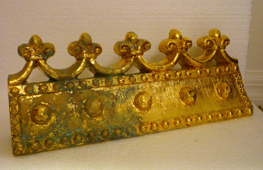
I do not recall where I picked up the resin shelf pictured here, but it turned out to be just the thing I needed to top off one particular work. I had been stumped on how to complete a work whose design had evolved several times and this turned out to be the perfect solution. However, I realized that turning the piece upside down was the best use for my particular needs.

The next alteration was designated for the finish of the piece. Though the patina of the shelf looked like aged metal, I knew that it would not complement the other surfaces of the piece, so I would need to change it. The photographs here show the process of changing the surface. I have written at other times about adding gold leaf to objects, but this will actually show the individual stages.


The surface of the object was first prepared by lightly sanding. Paint adheres best when the surface is slightly roughened. The entire surface was then covered with a deep red acrylic paint. I usually have to apply the paint in several steps since some sections need to dry before I can flip the object over and paint other areas. The traditional color of the undercoating for gold leaf is slightly more brown, but I like the contrast that comes from this more intense red, especially in the instances when I age the leafing.
 

Next, the surface is covered with an adhesive. It is brushed on as a milky white liquid, but dries to a glossy clear, sticky surface. Again, this has to be applied in stages since the adhesive will either stick to my hands or anything else if the whole surface is covered at once. In the meantime, the gold leaf is applied to the dried adhesive layer. Adhesive and leafing layer s are alternated until the entire object is covered.

The final steps are dependent on whether or not I want the object to be a shiny, pristine gold, or whether I want an aged and worn surface. For this piece the surface needs to be aged. A liquid chemical aging agent is then brushed over the surface. It is actually produced to create a green patina on copper materials. I do not use real gold leaf for this very reason. I use brass leaf that mimics gold. It is not because of the cost of gold—though that can be particularly expensive. The inclusion of copper within brass allows the leaf to be aged in a similar way. Sometimes the leaf all but disappears, making an abstract design in which mostly the red underpainting shows through.

The final stage of the process is the application of a final layer of polymer clear coat. This protects the gold surface from mars or scratches. It also keeps the brass leaf from changing. If it is needs to be kept pristine, it will be kept from any green oxidation. If it has already been aged then the oxidation is fixed at that point.


Thursday, May 5, 2011

Still Sorrowful: Passion in Venice at MOBIA


The narrative of the evolution of Modern art was transformed as the 1960s ushered in a cultural change. Any ideas that pure abstraction was aligned with a utopian ideal that would help us transcend the ills of the world were put to rest. People have not changed over the millennia. There are still good deeds and evil deeds; we hurt each other and may cause immeasurable pain. And while some contemporary people—artists among them—like to believe that we have progressed beyond religion and its “mythologies,” there is no denying that these belief systems point to universal archetypes that have been devised to explain our existence.

One of the most powerful images that crops up again and again is the sacrificial view of Jesus. While the concept of a figure sacrificing himself for the betterment of others is not reserved fully for Christianity, the unique image of the crucified Christ is so powerful that it is still inescapable within Modern and Contemporary art. All one needs to do is look at the work of Modernists during the mid-twentieth century to find that—even though Nietzsche had pronounced God as dead—the figure of Christ suffering on the cross was still a potent symbol. It was used by believers and unbelievers alike.

The current exhibition at New York’s Museum of Biblical Art (MOBIA)—Passion in Venice: Crivelli to Tintoretto and Veronese—focuses not so much on the crucified Christ as the suffering Christ. The works in this exhibit range from the fourteenth to sixteenth century and were mainly created in Venice, Italy or the surrounding area. They are not the traditional Pieta’ images that one might associate with an artist like Michelangelo, but a subset that was born out of Venice’s connection to the Eastern church.
  
This exhibition provides the best elements of a MOBIA show. Rare Bibles from MOBIA’s own collection are paired with works borrowed from other institutions in the city—The Morgan Library and Metropolitan Museum—and beyond—Italian institutions and the National Galleries of London and Washington DC. The curators pulled together an exceptional exhibition that considers not only master paintings but some processional and liturgical works. The consideration of Christ as the Man of Sorrows within the context of the Eucharist and other rituals of the Mass helps to explain why the image of the suffering Jesus, or Christ-like figure, is so enmeshed in our collective consciousness.

One of the prize works from the exhibit, Carlo Crivelli’s Dead Christ Supported by Two Angels, is typical of the minutely detailed work of this master. In this work, God truly is dead. Jesus is being laid in the tomb, supported by two infant angels. His flesh has been drained of all life and displays a rigidity. The wounds of his crucifixion are gaping and prominent. The grief of the angels, however, overshadows the figure of Christ. Their weeping eyes are sore and swollen from the tears. We feel the tragic state of all humanity.

A sixteenth century object within Passion in Venice is surely the most unique item in the entire exhibition. This small wooden sculptured head is considered a Memento Mori—a remembrance of mortality. One side displays the face of Jesus with a crown of thorns. On the reverse side is a sculpted image of a skull. The skull is not only a reminder of our short lives on earth, but a symbol of the crucifixion itself. The mount on which Christ was crucified—Golgotha—was called the place of the skull. However, the most intriguing portion of this interactive work is the miniature Man of Sorrows that pops up from the interior. Christ rises from the tomb of death in an act of resurrection.

One final contemporary addition to the exhibition is the video work entitled Man of Sorrows, by artist Bill Viola. The essential difference between this work and others in the exhibit is the element of time. Viola manipulates time that we might sense the agony of this human sorrow. The male figure—not a Christ figure—slowly sways from side to side. His mouth and eyes open and close in agony. We can share in his emotion. Though Viola is influenced by Christian mysticism, his interests in Hindu and Buddhist practices have also formed his aesthetic. This work, from a series entitled The Passions, shows that the core concepts of ancient Christian works remain potent symbols for us today.

The breadth and diversity of objects in this exhibition are only hinted at here. The catalog for the exhibit provides an excellent analysis of the pieces in the show, along with others. Passion in Venice continues the trajectory that MOBIA has set forth since its inception. It remains a unique institution that is willing to examine topics many other museums may not, in a scholarly way that proves they are a serious institution that has great things in store for the future.


Tuesday, March 29, 2011

Building Character


Even though I completed two altarpiece constructions within the past year, it has actually been about eight years since I actually built the structure of one. I had done plenty of work associated with the altarpieces, but I had not been building them. I prefer to use reclaimed lumber from old furniture when I can find it. When I was months away from moving to Massachusetts from Idaho I made a big push to build the structures for five or six of these works from my stockpile of wood, acknowledging that it was better to move half finished artworks across the country than a pile of wood. It then took several years to complete the figure paintings inside the “shells.”

In the intervening years I have worked on the plans for many more altarpiece works. I recently began building the structures for two of these. One is for a benefit for a museum in New York and the other is an older idea that incorporates more assemblage elements, giving a taste of the direction of future works.


I have stated before that I age these works much in the way that Joseph Cornell aged his own box constructions. I have included some photographs of these pieces in progress to show just how much effort goes into this aging process—well before the figurative elements are painted.

One image shows the unpainted state of a smaller construction. The wood is pine, with some additional elements of either aspen of poplar. The surface of the bare wood is usually scrubbed with a wire brush at this point, to bring up the grain. Most of the exposed wood on these pieces was next coated with a solution of vinegar that had a pad of steel wool soaking in it. This rusty solution oxidizes the wood, giving it a weathered, gray appearance.

The exterior sides of the boxes were then coated with a light green colored oil-based enamel paint. After that dried another coat of pink enamel was added. These colors were derived from the countless layers of paint that cover the walls of old American Protestant churches across the continent (although Catholic churches may exhibit the same thing). Growing up, I was often enlisted to help paint rooms in our church whenever some wall color went out of fashion or the use of a particular room changed. I recall many variations of pinks and light greens and yellows. So these colors show up in the altarpieces as a connection to this country’s religious history.


The next step entailed taking a heat gun (used to remove old paint), putty knife, and wire brush to the sides. This actually mixes the two colors a bit, but it also brings up the underlying layers of green paint and gray wood. Another layer of off-white (almond colored) oil enamel was then applied. This was given the same heat gun and scraping treatment. The interior boxes were treated in a similar manner using light yellow and off-white layers of paint.

Trim elements on the boxes are handled in a different way. The bare wood (without coats of the vinegar solution) is covered with a deep red acrylic paint. An adhesive is then carefully applied over the red. This adhesive goes on in a very liquid form—milky white—and dries clear.


The gold leaf—which is really made of brass—is then slowly applied. Large flat areas are easy to cover, but the intricate details and crevices in the decorative mouldings must be filled by pressing bits of the leafing in with a hard bristle brush. A chemical is then brushed over the metal leaf. This turns the copper elements in the brass to green. This may take multiple applications and some areas are still kept as unaltered gold. The final layer of this portion of the boxes is given a polyurethane clear coat that prevents the brass from changing any further.

When all this process is added to the time it takes to construct the boxes themselves, it is no surprise that I say that the painting of the images takes the least amount of time. I am very pleased with the effects in these recent works and will continue to post further updates of their progress.


Sunday, March 13, 2011

All the Lonely People, Where Do they all Come From?


Technology has sometimes been heralded as the great savior for frail humanity. The progress of twentieth century science and technology might now enable us to live longer, healthier lives, but is there a price to be paid for this purported immortality? The post-war population explosion of the “boomer” generation loaded increasing numbers of people into the urban centers of the United States. At the same time, isolation seemed to grow exponentially. Even in a bustling metropolis like New York City, people could feel overwhelmed by isolation in the midst of the masses. The earlier model of extended families living together, or at least in close proximity, gave way to a trend of siblings spreading out across the vast continental landscape with aging parents often relegated to cell-like rooms in nursing homes.

Though not curated to point out this predicament, recent exhibitions at New York’s Whitney Museum of American Art seem to align in a configuration that questions the state of human relationships in modern times. The Whitney’s collection of Edward Hopper paintings, as represented in the exhibition Modern Life: Edward Hopper and His Time, establishes a foundation that might consider the rampant feelings of isolation that were already being acknowledged in the early decades of the twentieth century. Though most Hopper paintings highlight single figures in lonely interiors, even signature works like Nighthawks occasionally present groups of figures separated by their estrangement from one another.

Hopper’s New York Interior exhibits the voyeuristic quality in many of the artist’s works. The viewer observes the evening ritual of a woman undressing before retiring for bed; mending a garment in a state of partial undress. Her mostly bared back suggests an intimacy that does not actually exist. The viewer and the viewed remain strangers who maintain lonely, isolated existences within their separate tenement cubicles. This kind of impersonal connection almost foreshadows some current internet-based relationships.

 In an uncharacteristic monochrome gray composition—Untitled: Solitary Figure in a Theater—Hopper explores the full weight of isolation experienced in an urban environment. The single figure, alone in a theater that can hold dozens, suggests feelings of insignificance that are sometimes produced in the midst of an enormous crowd. All others melt away and the individual is overwhelmed by loneliness. Even the lack of hue denotes this sadness.

The galleries containing Charles LeDray’s exhibition workworkworkworkwork addressed this concept of isolation from another perspective. While there is a great variety within the show, all the pieces are miniscule representations of actual, real-life objects. Miniature tableaux represent groupings of personal affects—materials such as magazines and items from a purse or briefcase are scattered in piles that recall the careless placement of personal materials in an enclosed private location, like on a nightstand.

 These tiny props suggest the activities of a solitary life. Miniature settings—like Mens Suits (2006-2009), which represent what seem to be the interior of a men’s clothing store or a dry cleaner’s—are fabricated from full-sized articles of vintage clothing. They convey the sadness of a life lost. Patterns and fabrics are reminiscent of the clothing given to thrift store after the death of an elderly family member.

The sport coats and ties of lonely, forgotten old men are refashioned to populate a parallel world. The absence of any figures within these diorama-like scenes only underscores the tragic, lonely feeling often associated with the elderly. The stories of the lives connected to these articles of clothing appear to be stunted, shortened, or chopped off. Forgotten.

The most visceral work to approach this topic within the Whitney’s permanent collection is surely Edward Kienholz’s The Wait. Often associated with Pop, Kienholz’s work is sometimes summed up in art history textbooks through a single image of this seminal work. Nonetheless, this multi-dimensional work can never honestly be reduced to a simple frontal photograph. It must be experienced in person to be fully comprehended.

One must move around the work to engage its complex structure. A frontal view reveals a skeletal structure composed of what appear to be cow—or some other large animal—bones. In a photograph, the area of the figure’s head and chest is, however, reduced to a mass of jars with highlights and reflections obscuring their contents. What appears as merely an antique photograph that “represents” the head of the woman in the work is only the most frontal element of that component. Behind that picture is a large glass jar containing a cow skull with life-like glass eyes.

The other jars include memories held close to the heart. Gold painted objects represent elements from childhood, marriage, and long-held faith. However, these golden memories are preserved and frozen in time like the cat, needlework, and photographs and Bible on the end table. All dripping with coats of clear resin that preserve them in this static scene.

The only element of The Wait not frozen in the past is the live parakeet in the birdcage. The droppings left on the end table by the bird may simply be seen as distasteful. They could better be read as an indictment. As a society we have left our elders to corrode in their failing memories. Their lives are prolonged by the advances of pharmaceutical companies as we separate them from the rest of “productive” society.

Few works have ever so forcefully tackled the epidemic of loneliness among the elderly as The Wait. The representation of social topics has a long history in art, but this concept has never been a popular theme. Again, it may be unintentional on the part of the Whitney, yet this configuration of exhibitions is timely. A consideration of the feelings of loneliness and isolation, particularly in difficult economic times, is worthy of artistic and curatorial attention.


Friday, January 7, 2011

Hiding, Seeking, and Culture Warring

If you came across the recent reports on visual art in the news this past December, you may have considered checking the year on your calendar. Tales of the current exhibition—Hide/Seek: Difference and Desire in American Portraiture—at the National Portrait Gallery in Washington DC revived memories of Jesse Helms and the culture wars of the late 1980s. Whenever sexuality and religion cross paths there is bound to be some commotion concerning national (aka: taxpayer) support of artists and art institutions. As was the case in the 1980s with Robert Mapplethorpe and Andres Serrano, and again in the 1990s with Chris Ofili and Damien Hirst, the yarn spun for the public was not quite a clear picture of the artwork actually displayed.

The National Portrait Gallery did learn something from the mistakes of another DC museum—the Corcoran. The Portrait Gallery’s exhibited photographs by Mapplethorpe are clearly far from controversial. Mapplethorpe will forever be linked with his photographs of S&M acts that led to the cancellation of the infamous exhibit at the Corcoran, after an earlier uproar in Cleveland. Though many in the arts continue to cry censorship, one wonders when common sense and prudence were abandoned. Museums may have substantial private funding, but they remain, essentially, public venues. A curator should probably always ask whether or not he or she would want a five year old son, daughter, niece, or nephew to stumble upon a work on a gallery visit. There will remain differences of opinion, but common sense prevails at some level.

The National Portrait Gallery did not simply suffer from a lapse in judgment in the choice of exhibiting the video, A Fire in My Belly, by the late artist David Wojnarowicz, it did not work hard enough, initially, to explain the goal of the exhibition. Hide/Seek is somewhat like the museum version of Brokeback Mountain—it plays the “Gay Portraits” exhibit to Hollywood’s “Gay Cowboy” movie. These may be catchy descriptors, but they are far from accurate when considering the breadth of humanity examined in each. The exhibition is touted as the first major museum show to consider the role of gender difference in the creation of artwork. That tends to get boiled down to a tagline explaining that the exhibition is composed of portraits of and by gay and lesbian individuals. That is not quite the full makeup of the show if one looks into the artists and works included. (check out the video gallery tour)

Museum historian and co-curator David C. Ward explains the goal a bit better—though after the fact—in a YouTube slideshow of several works. He describes how the exhibition was meant to discuss how sexual ambiguity and ambivalence run as a coded thread through American portraiture, allowing personal nuances that transcend gender or sexuality to get to the core issues of personal understanding and identity. Ward claims that the show attempts to go past a very simple and tired concept that art in reference to sexual orientation is only related to sexual acts, and therefore, explicit nudity.

The other curator, Jonathan Katz, however, does the show a disservice with some of his rhetoric. As the Founding Director of Lesbian and Gay Studies at Yale University, Katz can, at times, come across as militant in his stance. When Katz defines the show as “an exhibition explicitly intended to finally, in 2010, break a 21-year-old blacklist against the representation of same sex desire in America's major museums,” he is drawing a line in the sand with the museum establishment.  His charge that “the museum world is and has been systemically and profoundly homophobic since the Mapplethorpe controversy in 1989” may hold some truth. The only problem is that he isn’t a fundraiser at any of the those museums. Museum staff across the nation may very well agree with Katz’s beliefs, but they are still running businesses and know that the American public—sex-crazed though it is—does not generally desire to be challenged with shows about sexuality when visiting museums. If people want that they can go to any number of commercial galleries where this is not uncommon.

Conversely, an enduring problem with the criticisms brought by the Religious Right is that they tend to focus on the wrong problems in the works in these exhibitions. Ofili’s The Holy Virgin Mary was derided as a dung-smeared Madonna. The elephant dung that was used in that work was hardly a concern if one looked more closely. The painting was covered with images of hard core pornographic photos of women. That was not mentioned by Mayor Giuliani and others when they called for a halt on public funding for the Brooklyn Museum. One imagines most children would have more difficulty recognizing painted elephant dung than graphically displayed female body parts.

A Fire in My Belly was bound to face a similar fate. Speaker of the House John Boehner led the charge in attacking the work because it depicted a crucifix overrun with ants. Many people were likely more troubled with the concept of the “Gay Portraits” show and so Wojnarowicz became an easy target. In fact, his work was always controversial in his lifetime so he was a perfect scapegoat. One would think the appearance in the video of a man stripping off his clothing and then participating in an auto-erotic act, would have caused more alarm. This is certainly one of those things a curator might want to avoid when considering the five year olds. However, this part of the video was never the top concern in the news reports.

Outside of all the excessive press, which should make the curators somewhat happy since the exhibit would probably have never been known otherwise by the general public, there are some works within the exhibit that more fittingly engage the stated theme. Though there are clearly more erotic works by Marsden Hartley, the paintings chosen for this exhibition are more in keeping with the way an early American Modernist could use abstraction as a language to express identity in a time when even the art world was less open about sexuality. Works by Robert Rauschenberg, Jasper Johns, and Cy Twombly skillfully exhibit the “coded language” of mid-century gay artists. Their early postmodern experiments with semiotic and appropriational imagery set the tone for later generations of artists—gay and straight alike. The inclusion of one of Felix Gonzalez-Torres’ candy spill works is a prime example of this continuum.

 There are some works that seem more of a stretch. The inclusion of a painting of a proud male nude standing in an open field (The Clearing), by Andrew Wyeth, is a bit confounding. Wyeth was famous for generations though his most public notoriety came with the controversy surrounding his Helga paintings. A more appropriate connection for this exhibition would have seemed to have been the recent photographs by Collier Schorr that place an adolescent male in poses that mimic the Helga paintings. The ambiguity of sexuality is much more evident in those works.

The protestations of Katz that were actually the genesis for the exhibition reveal only a small segment of the current map of the art world. Gender and identity studies now abound in college and university course catalogs across the nation. Though this may be the first major museum exhibition of its kind, there is actually no lack of literature that discusses the role of sexual identity in the creation of art. Many artists showing at the major galleries in this country are now quite upfront and explicit about this fact.

In the new world where pluralism rules, the cacophony of specialized voices assures that no sub-culture or group can rise above the din. The voices that many would claim were the singular voices of the past—like Western Christianity—are now speaking in a foreign tongue. Consider the work of Tim Hawkinson. Many pieces are clearly influenced by the artist’s childhood, in which he was reared in Methodist Protestantism. An installation like Pentecost is equally misunderstood by the contemporary art world as the Hide/Seek artist’s works may have been earlier in the twentieth century.

At the pre-opening gallery walk for Hawkinson’s 2005 retrospective at the Whitney Museum, curator Lawrence Rinder was questioned about Pentecost. His simple response was that the title referred to a religious holiday. That the work taps out the melodies of hymns and references the New Testament coming of the Holy Spirit, resulting in the speaking of unknown tongues by Jesus’ disciples, was either not known to the curator, or more likely, was something he expected a post-Christian audience would not understand. Either way, the preferential position that Western Christianity once held is obviously no more. With this in mind, curators may consider that every new position examined in museum exhibitions will seem foreign to some segment of the viewing public. New viewpoints should be proclaimed but there are sometimes wiser ways to present them than through more controversial works.

Thursday, November 25, 2010

Cildo Meireles: Expositor of Brazil's Christ-Haunted South

Brazilian artist Cildo Meireles’ work, often considers the ongoing confluence of Christian European culture with that of the peoples of South America. Mission/Missions (How to Build Cathedrals), 1987, is composed of a narrow tower of communion wafers that teeters high above a sea of 600,000 glittering coins. The sky above the coins and wafers is a canopy of illuminated large animal bones.

Though mostly unknown to a North American audience, this Brazilian conceptualist’s work has been featured at nearly all the major international art biennials over the past few decades. Each time Mission/Missions is installed in a new location the coins used are drawn from the local currency; always utilizing the lowest denomination, the most insignificant coin. In keeping with the highly complicated relationship between Brazil and Western Europe, there is not an exclusive reading of the work.

When the Jesuits brought the Roman Catholic faith to the tribes of South America in a manner both nuanced and complex. This sometimes bore the marks of syncretistic faith in which elements of the indigenous religious systems were either transmuted or subsumed into Catholic doctrines. At other times Christianity was abruptly foisted upon the South Americans, producing a hybrid culture that remained neither Western European nor native Brazilian. On the heels of this religious conversion came the much darker aspects of colonization. The natives were enslaved as cheap and expendable labor while the Spanish and Portuguese stripped the land of its wealth and resources, often in the sign and name of Christ.

The enduring shadow of Western capitalist traditions stretches even further over the form and materials of Mission/Missions. The pendulous expanse of bones can be understood as a metaphor for the slaughter of the indigenous peoples brought about as a result of colonial enslavement. Yet, a more contemporary reading might connect the bones to the consumerist economics of first world beef production. Brazil has been transformed into one of the world’s leading cattle producers. That beef is raised on the deforested parcels of land that once hosted the Amazon forests. The allusion to death implied by these bones may also signal the larger ecological impact Western traditions and systems have placed on not only the global South, but the entire planet.

Meireles’ message has often been political. The ‘60s and ‘70s found Brazil in political upheaval after a military coup brought to power a dictatorial government in 1964 and kept the population living in fear for over two decades. Meireles always understood that that political unrest was a descendant of colonization and that the adverse effects of early colonial impositions could never be completely separated from the Roman Catholic faith that arrived with that system. The allusions within and titles of the artist’s major works often reflect this.

An example is found in the currency of Brazil that mirrors the entrenchment of Catholicism within the culture. Brazilian banknotes are called Cruzeiro—cross—and this is not lost on Merieles. In the 1970s he produced several works that utilized this currency. The Zero Cruzeiro (1974-8) banknote contains two portraits: a native Brazilian man and an insane man. It is a work that not only makes comment on the economy but on the condition of the intertwining relationship between Brazil and the religion of the Europeans. The figures represent the discarded, those rendered as worthless within the culture. This idea of worthlessness also connects to the hundreds of desaparecidos—the disappeared. These were the outspoken political figures who were abducted by Latin American military governments, including Brazil’s, in the 1960s to 1980s, never to be seen again.

The Zero Cruzeiro project is directly tied to the Insertions into Ideological Circuits projects. For some of these, Meireles stamped messages on actual cruzeiro banknotes and then reinserted them into circulation. Messages such as “YANKEES GO HOME!” implicate not only the Western Europeans but the North Americans. This process was also employed with United States dollar bills. These altered currencies continued to function in their intended ways, yet also acted subversively throughout the culture.

Another of the Insertions used equally common and utilitarian objects: glass Coca Cola bottles. These bottles used the standard deposit system of the period to promote reuse. When empty of their contents, the artist printed similar messages on the sides of the bottles. These remained essentially invisible until they were reintroduced to the Coca Cola factory and then placed, refilled, back on store shelves. The message “YANKEES GO HOME!” was all the more appropriate when visible on a product that remains a potent international symbol of American consumerism. The printing of this message on both the bottles and the dollar bills is an obvious indictment of the Monroe Doctrine and the influence and intervention of the United States in Latin American affairs.

A larger room sized installation, Red Shift, 1967-84, appears to be born out of Minimalist environments. The first of the three rooms in the installation—Red Shift: I. Impregnation—is arranged like an actual living space in a home, except that every object is red. These consumer products and materials were all created red at the factory, they are not simply painted to fit the space. There are variations in the hue, but there is an overwhelming sense of being engulfed in this color. Even the subtitle of Impregnation suggests an encasement within a womb.
As one enters Red Shift there is a sense that there is more to the space than the mere unease related to color perceptions. There is a noise—the sound of constantly running water—yet in this chamber there is no indication as to where the sound is centered. This beckons the observer to move deeper within the environment.

In the second room (Red Shift: II. Spill/Surrounding) one encounters a corridor where a small glass bottle appears to have spilled an unknown red liquid all over the floor. Closer inspection reveals that this liquid would actually fill a volume much greater than that of the small bottle. The viewer is confronted with this inconsistency. The direction of the spilled red liquid then leads into the final room: Red Shift: III. Shift.

Here, the viewer experiences a darkened space with a large porcelain sink, tilted diagonally, with a continuous flow of red liquid spewing and splattering from the spigot. It appears that this is what the viewer was meant to eventually stumble upon. Though his methods and materials are certainly varied, Red Shift is a work that seems somewhat different from earlier Meireles works. The spatial considerations seem to connect it to the rest of his oeuvre, while the strain of Roman Catholic imagery and symbols also connects the works and cannot be denied. Just as there are multiple interpretations of the animal bone “sky” of Mission/Missions, there are undoubtedly various analyses of this bloody fount in Red Shift.

Contemporary art aficionados might connect the sink in Red Shift to the sinks in the work of American Robert Gober. A former Catholic, Gober works out of a similar place as Meireles, wherein the iconography of centuries of Roman Catholicism subconsciously manifests itself in multifaceted forms. Both artists endow ordinary objects with manifold symbolic meanings. Though Gober’s sinks reference concepts of baptism and sexuality, both artists, through the use of porcelain bathroom fixtures, automatically reference Marcel Duchamp’s infamous Fountain.

Since much of Meireles’ work explores the sufferings of the indigenous Brazilians at the hands of their European colonizers, the blood-like flow of Red Shift seems to indicate Brazil’s blood soaked landscape. Whether referencing incidents from the sixteenth century or the late twentieth, the sacrificial tenor of the work may also lend itself to other interpretations. After all, the red flowing fountain in Meireles’ work digs deeper into art historical sources than those of just the past century.

Red Shift‘s biblical allusions are more clearly recognizable in a much earlier pre-Renaissance work by Hubert and Jan van Eyck. The Adoration of the Mystical Lamb is better known as the Ghent Altarpiece. Its central image portrays a scene from the final New Testament book of Revelation in which the hosts of heaven bow down before Jesus in the guise of the Lamb of God. The Lamb, standing on a sarcophagus that resembles the high altar of a church, spouts a stream of blood into a eucharistic chalice. There is something about the purity gained through the messy affair of sacrifice that links the van Eyck painting to the Minimalist scene spattered with blood in Red Shift.

Each artwork mimics the late nineteenth century hymn, Are You Washed in the Blood of the Lamb?(Elisha Hoffman, 1878):

When the Bridegroom cometh will your robes be white?
Are you washed in the Blood of the Lamb?
Will your soul be ready for the mansions bright,
And be washed in the blood of the Lamb?

Are you washed in the blood,
In the soul cleansing blood of the Lamb?
Are you garments spotless?
Are they white as snow?
Are you washed in the blood of the Lamb?


This is essay is a shortened and edited version of the one that will appear in the Spring 2011 issue of CIVA's SEEN Journal.

Sunday, October 17, 2010

I Come to the Garden Alone

Over the past two years I have grown more accustomed to sharing the stages of progress of my work. It remains somewhat difficult at times to let others see some of the more raw stages of certain pieces. There are times when the unfinished work simply doesn’t look that good. Still, I realize that for many non-artists a glimpse of how an artwork comes to be is quite interesting.


During the past few months I have slowly been working on a mural project for a Central Florida church. I have included a few images here of the early stages of the painting. There is also a short video that shows the preparation of the 6’ x 8’ panel on which I am creating the painting—quite a lengthy process itself. In Florida, it is far easier and more comfortable to produce a work of this size within air conditioning, out of the direct sunlight and humidity.


The church board asked me to consider producing this mural for a garden courtyard. There were not many parameters other than that. My concept for the image was inspired by the intended location of the work and the already established pictorial scheme of the church. There was previously no image of Christ in Gethsemane so this image fit quite well.

I also chose to paint over text, as I have been doing in my altarpiece series and several watercolor works. The text here, though much of it will be obscured, is taken from the Anglican Book of Prayer—the liturgy for the Eucharist. That communal event is foundational to the life of the Church. The image will be obvious from a distance, but the inquisitive viewer will also find nuances within the text when viewing it closely. The combination of word and image is also a direct reference to Jesus himself—the Word made flesh.

As with the oil on book pages works (the altarpieces), I have begun with an underpainting of dioxazine purple. That choice may seems strange to people. It is such a vibrant color. The purple does modify quite easily when subsequent layers of color glazes are placed over it. In these images there are passages where yellow has been applied over the purple. The complimentary nature of these colors changes the purple into a neutral brownish color, bringing out some of the more red hues the purple. On top of that, translucent white is slowly built to form the gowns. The text is more visible in certain areas than others. This begins to give an idea of how the painting will proceed.

While the imagery is somewhat different—more obviously narrative—from many other pieces that I typically produce, I have found the process of collaborating with a community of people an interesting challenge. I have to make the work pleasing to a group of people while keeping an artistic integrity for myself. This is my test for the success of the final piece. Keep checking back to see the progress.