Showing posts with label Altarpiece Constructions. Show all posts

Sunday, July 15, 2012

The Eyes Have It


Sometimes art makes us uncomfortable, or rather it should make us uncomfortable. I recognize that this flies in the face of popular concepts of art consumption. When many people consider “decorating” their homes with art they gravitate toward the tranquil, peaceful, and beautiful. If the work matches the sofa all the better. I have no problem with considerations of color palette. The work in my living room actually matches the furniture, too. We are bound to be attracted to specific color combinations. That, however, is not my main point.

There is a time and place for beauty, but that is not the only purpose of art in the twenty-first century. Art has a forcefulness to it and to neglect that power is to push it into the background—to make it wallpaper. Some art, even that placed in the sanctuaries of our homes, should cause us to pause and consider the deeper aspects of life.

Art that deviates from the beautiful or causes us to consider the great questions of life may not be what everyone wants in his or her bedroom, but it does have a place in the home. This kind of imagery works on us over time. It forms and informs us in subtle ways. If that work is not within our living spaces, but only in museums, then it does not fulfill its purpose. It does not reach its potential.


With all this in mind, I recently obtained several sets of antique doll eyes (pictured here). These are the type of eyes that close when Betsy Wetsy is placed on her back for naptime. The lead weights dangling from the bottom of the pairs of eyes causes them to pivot inside a doll’s head. The first time I came across some of these was at a summer art workshop. A friend had some reserved for an assemblage project. I was fascinated at once.

They are creepy. I will not deny that. Any time we find eyes loosely roaming outside of a head it is creepy. The fact that some of these sets are missing one eye and that I have other eyeballs rolling around that are not even connected to these sets makes them even creepier. I purposely photographed them on the crushed red velvet because it adds a bloody element that is even more disturbing. Maybe not what you want to see when you first awake in the morning, but the unsettling quality can be beneficial.

The idea of using these eyes has been gestating within me for about six years. Even before I purchased some of them I was writing notes about their “artful purpose” within my sketchbooks. Once I had them in hand I started making sketches for the altarpiece construction for which I envisioned them. A few days after I made these initial sketches I found some old notes in another place in my sketchbook and found that the combination of objects and imagery I had been sketching was something I had already been thinking about much earlier, though I had forgotten.

As is normal for postings like this, I’m not going to divulge too much more information about what I plan to do. However, I am going to share that these eyes will be used alongside a type of book page—a form of text—that I have not previously utilized. Gospel pages from a Braille Bible. Okay, now I’m ruining the suspense. Keep checking back for future details.

Sunday, June 10, 2012

Pipe Down!


Each individual artist works at his or her unique pace. I have some artist friends who are so prolific that I still cannot comprehend how they complete so much work. Other artists may only complete a dozen or so works in a year. That can sometimes mimic the quantity of my own output, though that has more to do with teaching nine months or more during each year. And some artists who work full-time on their art are simply just methodical and thoughtful craftsmen, so their output can be nothing other than minimal.

Because I work in a variety of media, some pieces naturally take longer than others. I have stated previously that the altarpiece constructions tend to be multi-year projects. There are several reasons for that. The actual construction of the boxes takes some time, followed by many additional steps in the finishing process of the exteriors. The painting portions take some time, too. Additionally, there are years of “fermentation” time during which I think about the form, imagery, and objects that will compose these works. The complexity of the work dictates this kind of extended timetable.

A few years ago I first mentioned that I had rescued two keyboards from an old, discarded organ. I had not yet decided how I was going to utilize them. In the intervening years I have worked on various sketches and changed my mind numerous times. Early on I had decided that this piece was going to look somewhat like a pipe organ. Just how I was going to achieve that look was uncertain.

I regularly spend many hours wandering the aisles of home improvement stores, considering how I might use materials in ways that are typically dissimilar from their intended purposes. While doing this, I worked through a few different concepts for the pipes for the “organ” project. For part of the time I considered using metal pipes. There were various types of metal pipes that I considered, but they all seemed too heavy. Then I thought about using PVC pipe, applying gold leafing so it would appear to be metal. That solved the weight problem but the time investment seemed a bit burdensome.

Eventually, I returned to the core of my original concept. I wanted this to look like a pipe organ, but finding actual organ pipes was going to be difficult. Then I thought of one of my favorite places to find inspiration—eBay. There were often pipes available there but most were full sets from old organs and they cost many thousands of dollars. They were also far larger than what I intended to use. It took a few months, but I finally did find some small sets of pipes that were perfect for my design.

One change, that I had not previously been considering, was the use of wooden pipes. I found some small wooden pipes and then some other, larger ones. The small ones were just the size I had been searching for. The larger ones, I decided, could be used more structurally within the piece; more as a decorative embellishment. However, I still wanted to use some metal pipes. Those were elusive. But I did manage to track down a set that fits perfectly with the smaller wooden pipes.

Sometimes I am willing to make slightly larger purchases for materials, for the sake of the artwork. This piece needed the authenticity of the actual organ pipes. They are, however, only one portion of this much larger project. I expect this construction will be far larger than any previous  altarpiece works I have completed or designed. The pipes and keyboards are just a couple portions of a much greater scheme. I look forward to sharing more of the process as I begin constructing the work later this year.


Monday, March 12, 2012

Ch-Ch-Ch-Changes


After a significant absence, I have returned to the blogosphere. Thank you to those who have been followers of this blog and who have voiced their interest and comments about the subjects discussed. I do intend to keep up with the entries on a more regular basis, though, if I have to forego something, writing about artwork—mine or that of someone else—is likely to be on the chopping block before actually creating artwork.

I have stated at various times that the process of creating my altarpiece constructions is quite lengthy. The initial ideas and sketches typically come several years before the finished products. Sometimes that is because I am searching for very specific elements and objects to place within the works. It also takes some time to build and age the physical structures. The piece shown here was mostly constructed in the summer of 2011. However, the very first sketches for this work were likely produced in 2003 or 2004. My memory on that is a bit hazy. I tend not to date sketches because I will work on them again and again over several years.


Within these sketches the progression of the concept is seen. I do know that this work came about from the acquisition of several pieces from an antique store in New Hampshire. The first sketch shows some specific elements, most obviously the small electric fan on the top. At that stage, I intended to place some sculptural wings along the top, as well. I never did find any wings that would be appropriate. Eventually, I happened upon a set of porcelain dove salt and pepper shakers at another antique store somewhere near Washington DC, while visiting a friend. They became an alternate solution for the wings.

Two sketches appear next to each other in the second example—these are even in a different sketchbook as the first one had already been filled. The first image subtracts the wings and includes only one of the doves. The sketch below it has included both doves and some additional, new elements. One is an antique military-issued gas mask. Another is two metal acanthus leaf finials of some sort. Those finials were in a box of “junk” that I picked up at a flea market in Massachusetts at least a year or two later. They were not even what I actually wanted in that box of objects, yet I found a use for them.

The evolution of this work was slow. Still, the fan remained as kind of a crown on the top of the piece. Even while the work was being built that was the intention. When I was recently gearing up to work on the piece again, finishing off the trim and all the gold leafing and aging, I decided the placement of the fan on the top was just too much. A sketch, after all, is still distinctly different from a physical, three dimensional thing. Proportionally it did not seem right. The entire work was too tall and the fan seemed spindly in that spot. The fan was, however, an integral element from the conception of this piece.


I recognized that the fan could fit inside the uppermost section and would still operate as a type of oculus for the work. This did require that I shift some of the remaining elements into some other areas and boxes in the piece, but the new solution was much more satisfying. The altarpiece is now ready for the final painting stage and should be finished within the next couple months. That means that it will be nearly a ten year endeavor. That may seem too long for some artists. For a work like this it is just the right amount of time. These pieces need to evolve and change over time. The nuances that are manifested over the creation of the pieces also work on the viewer over longer periods of time. The works are not static, but reveal more with each additional viewing.

Monday, June 6, 2011

Discounted Transformations

One of the sources of inspiration for my newer altarpiece constructions is visits to antique stores and junk shops. Since I have lived in various areas of the U.S. I have come to understand that what people believe to be “antique” in some places is considered junk in others. I will not pay top dollar for junk. I find that picking up trash from the side of the road is much more economical. You tend to get the same things for free, but with added character.


I do purchase some items cheaply at antique stores. For instance, the ceramic dove salt and pepper shakers, that I covered in gold leaf for one of my current projects, were perfect additions to that piece. They were inexpensive, too. Still, there is another type of place that I sometimes frequent to find the odd object to include in an altarpiece—discount stores. TJ Maxx and Marshall’s have been particularly helpful. Other stores that carry home decorations are also great. The resin or plastic items often found at those stores can be particularly interesting.
 
I do not recall where I picked up the resin shelf pictured here, but it turned out to be just the thing I needed to top off one particular work. I had been stumped on how to complete a work whose design had evolved several times and this turned out to be the perfect solution. However, I realized that turning the piece upside down was the best use for my particular needs.

The next alteration was designated for the finish of the piece. Though the patina of the shelf looked like aged metal, I knew that it would not complement the other surfaces of the piece, so I would need to change it. The photographs here show the process of changing the surface. I have written at other times about adding gold leaf to objects, but this will actually show the individual stages.


The surface of the object was first prepared by lightly sanding. Paint adheres best when the surface is slightly roughened. The entire surface was then covered with a deep red acrylic paint. I usually have to apply the paint in several steps since some sections need to dry before I can flip the object over and paint other areas. The traditional color of the undercoating for gold leaf is slightly more brown, but I like the contrast that comes from this more intense red, especially in the instances when I age the leafing.
 

Next, the surface is covered with an adhesive. It is brushed on as a milky white liquid, but dries to a glossy clear, sticky surface. Again, this has to be applied in stages since the adhesive will either stick to my hands or anything else if the whole surface is covered at once. In the meantime, the gold leaf is applied to the dried adhesive layer. Adhesive and leafing layer s are alternated until the entire object is covered.

The final steps are dependent on whether or not I want the object to be a shiny, pristine gold, or whether I want an aged and worn surface. For this piece the surface needs to be aged. A liquid chemical aging agent is then brushed over the surface. It is actually produced to create a green patina on copper materials. I do not use real gold leaf for this very reason. I use brass leaf that mimics gold. It is not because of the cost of gold—though that can be particularly expensive. The inclusion of copper within brass allows the leaf to be aged in a similar way. Sometimes the leaf all but disappears, making an abstract design in which mostly the red underpainting shows through.

The final stage of the process is the application of a final layer of polymer clear coat. This protects the gold surface from mars or scratches. It also keeps the brass leaf from changing. If it is needs to be kept pristine, it will be kept from any green oxidation. If it has already been aged then the oxidation is fixed at that point.


Tuesday, March 29, 2011

Building Character


Even though I completed two altarpiece constructions within the past year, it has actually been about eight years since I actually built the structure of one. I had done plenty of work associated with the altarpieces, but I had not been building them. I prefer to use reclaimed lumber from old furniture when I can find it. When I was months away from moving to Massachusetts from Idaho I made a big push to build the structures for five or six of these works from my stockpile of wood, acknowledging that it was better to move half finished artworks across the country than a pile of wood. It then took several years to complete the figure paintings inside the “shells.”

In the intervening years I have worked on the plans for many more altarpiece works. I recently began building the structures for two of these. One is for a benefit for a museum in New York and the other is an older idea that incorporates more assemblage elements, giving a taste of the direction of future works.


I have stated before that I age these works much in the way that Joseph Cornell aged his own box constructions. I have included some photographs of these pieces in progress to show just how much effort goes into this aging process—well before the figurative elements are painted.

One image shows the unpainted state of a smaller construction. The wood is pine, with some additional elements of either aspen of poplar. The surface of the bare wood is usually scrubbed with a wire brush at this point, to bring up the grain. Most of the exposed wood on these pieces was next coated with a solution of vinegar that had a pad of steel wool soaking in it. This rusty solution oxidizes the wood, giving it a weathered, gray appearance.

The exterior sides of the boxes were then coated with a light green colored oil-based enamel paint. After that dried another coat of pink enamel was added. These colors were derived from the countless layers of paint that cover the walls of old American Protestant churches across the continent (although Catholic churches may exhibit the same thing). Growing up, I was often enlisted to help paint rooms in our church whenever some wall color went out of fashion or the use of a particular room changed. I recall many variations of pinks and light greens and yellows. So these colors show up in the altarpieces as a connection to this country’s religious history.


The next step entailed taking a heat gun (used to remove old paint), putty knife, and wire brush to the sides. This actually mixes the two colors a bit, but it also brings up the underlying layers of green paint and gray wood. Another layer of off-white (almond colored) oil enamel was then applied. This was given the same heat gun and scraping treatment. The interior boxes were treated in a similar manner using light yellow and off-white layers of paint.

Trim elements on the boxes are handled in a different way. The bare wood (without coats of the vinegar solution) is covered with a deep red acrylic paint. An adhesive is then carefully applied over the red. This adhesive goes on in a very liquid form—milky white—and dries clear.


The gold leaf—which is really made of brass—is then slowly applied. Large flat areas are easy to cover, but the intricate details and crevices in the decorative mouldings must be filled by pressing bits of the leafing in with a hard bristle brush. A chemical is then brushed over the metal leaf. This turns the copper elements in the brass to green. This may take multiple applications and some areas are still kept as unaltered gold. The final layer of this portion of the boxes is given a polyurethane clear coat that prevents the brass from changing any further.

When all this process is added to the time it takes to construct the boxes themselves, it is no surprise that I say that the painting of the images takes the least amount of time. I am very pleased with the effects in these recent works and will continue to post further updates of their progress.


Sunday, October 17, 2010

I Come to the Garden Alone

Over the past two years I have grown more accustomed to sharing the stages of progress of my work. It remains somewhat difficult at times to let others see some of the more raw stages of certain pieces. There are times when the unfinished work simply doesn’t look that good. Still, I realize that for many non-artists a glimpse of how an artwork comes to be is quite interesting.


During the past few months I have slowly been working on a mural project for a Central Florida church. I have included a few images here of the early stages of the painting. There is also a short video that shows the preparation of the 6’ x 8’ panel on which I am creating the painting—quite a lengthy process itself. In Florida, it is far easier and more comfortable to produce a work of this size within air conditioning, out of the direct sunlight and humidity.


The church board asked me to consider producing this mural for a garden courtyard. There were not many parameters other than that. My concept for the image was inspired by the intended location of the work and the already established pictorial scheme of the church. There was previously no image of Christ in Gethsemane so this image fit quite well.

I also chose to paint over text, as I have been doing in my altarpiece series and several watercolor works. The text here, though much of it will be obscured, is taken from the Anglican Book of Prayer—the liturgy for the Eucharist. That communal event is foundational to the life of the Church. The image will be obvious from a distance, but the inquisitive viewer will also find nuances within the text when viewing it closely. The combination of word and image is also a direct reference to Jesus himself—the Word made flesh.

As with the oil on book pages works (the altarpieces), I have begun with an underpainting of dioxazine purple. That choice may seems strange to people. It is such a vibrant color. The purple does modify quite easily when subsequent layers of color glazes are placed over it. In these images there are passages where yellow has been applied over the purple. The complimentary nature of these colors changes the purple into a neutral brownish color, bringing out some of the more red hues the purple. On top of that, translucent white is slowly built to form the gowns. The text is more visible in certain areas than others. This begins to give an idea of how the painting will proceed.

While the imagery is somewhat different—more obviously narrative—from many other pieces that I typically produce, I have found the process of collaborating with a community of people an interesting challenge. I have to make the work pleasing to a group of people while keeping an artistic integrity for myself. This is my test for the success of the final piece. Keep checking back to see the progress.

Sunday, July 4, 2010

Public Observations of Private Lives


More and more, I believe that the role of the artist has less to do with the creation of a specific object or thing and more to do with observation. The artwork may be a byproduct that lets viewers into these observations, but the artist has always been an individual with a keen sense of observation. The artwork may no longer consist of a representational image or object, still, the medium will convey unambiguous insights.


When we consider the naturalism of the Greeks and Romans, or the precise renderings of the various artists of the Renaissance, it is the skills of observation that seem to most impress us. And after the invention of the camera caused artists to reassess the nature of their work, observation was still a chief concern. The Cubist abstractions of Picasso may seem far removed from the precisely accurate depictions of a Northern Renaissance master, but the Spaniard’s attention to the objects before him was what allowed for greater understanding of the essence of physical objects.
 While I continue to employ naturalistic representations in my work, it is not the close observation and subsequent rendering of the people and objects that matters most. My observations of human nature and personal interactions is what I desire viewers to contemplate.

I find myself fascinated with the interactions of people in public settings and spaces. Our private lives have somehow made their way into the public sphere. Technology is a catalyst, but it is amoral so it can’t bear any of the blame.

Private telephone conversations, that fifteen years ago would have taken place between two people within the privacy of their respective homes, are now on public display. Facebook and Twitter have accelerated an earlier technology—email—by pushing more private conversations, that would have taken place among only a handful of individuals, onto the world stage. Yet these are only the tools by which individuals express their conversations.

There is something at work within the mind of the individual that has nothing to do with the tools of technology. It may be a type pf exhibitionism or narcissism that drives some people to share their lives so openly. For my part, I seem to get sucked into these dramas playing out before me in the same way that many of us find ourselves drawn to the equally inappropriate behaviors of “characters” on reality television programs. After all, most of us have at least one guilty pleasure television show, and we don’t watch these for the insights into the wholesome and good natured lives of the “cast members.”

Again, all these “outer” things that we observe are merely symptomatic elements. The reality television shows are edited so that our opinions of the characters are manipulated into polarized camps. The half conversations that we overhear in the checkout line of the grocery store are also edited. We can’t hear the phrases, emotions, and tone of speech offered on the other end on the line. This is why I don’t trust the single occurrence of private/public behaviors. I seek out patterns of behavior within groups over time, or multiple instances of similar behaviors in anonymous individuals.

A recurring symbol of scrutiny and observation in my work is the “lensed” object. These take the form of magnifying and eye glasses, microscopes, binoculars, film and movie cameras, and even Viewmaster viewers. These objects give us clearer vision. they bring details into focus and allow us to capture moments, both public and private.

Another device that appears (or rather will appear—most of the works including these elements are still in production) is the mirror. While most of my observations are of the public/private variety detailed above, I do not neglect the idea that we constantly need to hold the mirror up to ourselves to assess our own behaviors.

As I stated before, the behaviors tend to be symptoms of things deeper. Often, our most public behaviors—good or bad—are indicators of character. They may also suggest unresolved or unconscious psychological developments. For me, this ties into the use of words and images together. The images may suggest one meaning through a cursory examination, yet they reveal a deeper truth as we “read into them.” It is only close observation that provides a deeper assessment and understanding.

Monday, May 10, 2010

What Lies Beneath: Underpainting as a Technique

The tradition of building up glazes of pigment to produce a rich and subtle form in painting goes back to the introduction of oil painting as a medium—often attributed to the Flemish painter Jan Van Eyck. In the Renaissance, artists preferred to create an underpainting in a single color on top of which they would layer the glazes that completed an image with a finished, naturalistic appearance.

Over time, the use of glazing as a method of painting fell out of fashion. By the time of the Realists and Impressionists (mid-19th century French painting movements) painters were beginning to favor a more immediate approach, with thicker paint application. This resulted in paintings that resembled something other than the photographs that were becoming increasingly more commonplace.

Even though I experimented with a variety of painting techniques when I was in my undergraduate painting courses (including glazing), I ended up preferring an approach that was closer to Realism. I enjoy the freshness and vibrancy of the colors. In fact, when I now paint just for the fun of it this tends to be the style to which I revert.

When I began painting on book pages the approach of painting with a thicker, more opaque paint soon revealed itself as unsuitable. I started investigating the process of glazing once more. The first problem I encountered was the dullness of color that is often traditionally associated with glazing.

Painters in the Renaissance preferred either the dull green, terre verte, color or a brownish pigment (burnt umber) as an underpainting. Starting with a more neutral color allowed the artists to temper the form with additional colors in order to make the image more vibrant, or less, according to their particular needs.


Some artists, such as Leonardo da Vinci, used a combination of brushes and their fingers or hands to produce the underpainting. Examples, like da Vinci’s unfinished Adoration of the Magi, provide a glimpse to non-painters of what an underpainting entails. A painting, at this stage, is actually more of a drawing. It provides a foundational structure in a full range of values. Leonardo’s finished works tend to exhibit little more color since he preferred a smokier, more atmospheric effect that lacked hard shadow edges.
Duccio was producing paintings in the era prior to Leonardo. Much of his work was actually in egg tempera, a precursor to oil paint. In fact, many artists continued to use tempera as an underpainting even though they completed the glazes in oil. The tempera dries to a hard surface and dries much quicker than the oil medium. In Duccio’s work we can see the effect of the terre verte underpainting. Some pigments fade over time when exposed to light. In Duccio’s work we find the green underpainting showing up as the skin color.

When I began to use glazing again I chose to use a color for underpainting that is not typically employed—purple. You don’t necessarily notice it in the finished works, but the underlying values are completed with this dioxizine purple. This forces me to glaze over the purple with other, equally intense colors. Thus, the images tend to retain something of the vibrancy I prefer, but also the transparency that is desired for the works on book pages. The text is still somewhat readable.

Here I have included some photos of one of the new altarpiece constructions in process. Few people ever get to see my work in this state, before I apply the subsequent layers of color. I chose to share these images to provide some additional insight into the process.

Monday, April 26, 2010

In the beginning was the Word

Two recent conversations have reminded me that, while people are intrigued by my use of book pages as a substrate for painting, that material can be disconcerting for others. The first conversation happened when discussing possible materials for use in a drawing student’s final project. I mentioned book pages and she vigorously objected. She said that, having worked for a library, she had too much respect for books to tear the pages out. I assured her that, having worked for three libraries and a bookstore myself, I had no less respect for books.

The second conversation happened via email with a friend and collector. I was describing the recent 1821 German Bible I had acquired from a local used bookstore and noted that I was excited to start tearing the pages out. My friend has actually purchased some of my works on book pages, but assured me that his fundamentalist upbringing has so marked him that he felt he could never tear pages out of a Bible.

It actually took me some time to warm to the idea of removing pages from Bibles and hymnals—or any other books for that matter. I asked a couple artist friends about their use of Bible pages first. I then began experimenting with work on book pages by using books other than Bibles, and texts that I wasn’t planning to keep in my own library. Eventually, I began to use Bibles, hymnals, and other religious texts. I found these in used bookstores and at flea markets. These tend to be forgotten books that have no remaining connection to their original owners.

This German Bible is a good example. It is one of those old, large family Bibles in which people used to write births, deaths, and marriages—the kind that were passed down over generations. There are many things handwritten—in German—on the front pages. I can’t read any of it. It seems, to many people I know, that dismantling such a book, which must have a rich history, is a travesty. That is one way to look at it.

I see the re-use of this book within artworks in a different way. Yes, there are pressed flowers, prayer cards, and a lock of hair scattered between the pages. However, no one had a lasting connection with the people those items represented anymore, otherwise they would not have given the book away. The book is also somewhat unreadable. The pages are riddled with discolorations and foxing. When I use the pages for a painting they get a new life—they are resurrected.

Not only does the text itself matter in the paintings, the connection with history is important. Since many of my works consider the lives of saints—canonized or otherwise—the continuity with those who have gone before us is essential. The quiet lives of the ordinary folks, unknown by the masses, are equally significant in the scope of things.

As an artist, I wish to invite viewers into my work in as many ways as I can. For some, it is the visual images themselves that draw a connection. For others, the existence of text within the works seems like an invitation to learn some deeper truth about the work that the image itself does not readily reveal. There is even a segment of viewers who, sensing the age of the book pages, feel a connection to a common history. These are all valid approaches. Feel free to pick whichever point of entry feels most logical. The work is multifaceted and open to several interpretations.

Saturday, April 10, 2010

Karma Chameleon

Having a variety of interests can pose a challenge. For me, it has never been quite like the saying about the Jack-of-All-Trades, but dividing time among a multitude of interests certainly takes time from those things about which one is most passionate.

In the late 1990s, when I was teaching full-time, I tended to use the semesters as a time for reading, research, and sketching. Printmaking, particularly, was accomplished in the summer months. In those months there was plenty of time and no one else using the studio. When I was later working full-time as the director of an art non-profit there were no summer breaks, though I kept generating complex ideas for future artworks.

Having the ability to devote nearly all of my time to producing art over the past year and a half opened my eyes to something. I can never keep up with all the ideas. Even though I am producing exponentially more artwork than before, it takes time to actually create it. While carving a woodblock or painting on a book page a new thought is bound to enter my mind—another rabbit hole is opened and the chase begins again.

Occasionally, the reason I take several years to complete a piece has nothing to do with the time it physically takes to complete it. Many of the altarpiece constructions are developed through sketches and the assemblage items are devised at that stage. I often have some items collected already, awaiting an altarpiece in which they can be placed. At other times I imagine an object I would like to use, but then I have to search to find it.

The hunt is always on. I have previously relayed stories on this blog about my search for chattering teeth and doll parts. My great white whale, for several years, was a chameleon figurine. Aside from eBay and Google searches I have looked at dozens of flea markets, antique stores, and junk shops everywhere from New York City to Los Angeles—I mean this literally. There was a glimmer of hope in New Haven, CT when I spotted a plastic chameleon in a shop window display. It was, unfortunately, there for effect but not for sale.

When I recently stopped into an arts and crafts supply store, for an unrelated item, I spotted a wooden lizard. It was a somewhat generic lizard, but I knew it could easily be transformed into my reliquary chameleon. After I bisected a glass bead, for the eyes, hollowed out some eye sockets, and applied paint and gold leaf, the chameleon was complete. One of the best parts is that it still functions like a child’s toy—giving it a certain Joseph Cornell air.

I imagine that through all this discussion you may be wondering, "Why would you place a gilded chameleon in a reliquary anyway?" Without divulging too much about the work in progress, I will mention that the chameleon reflects the very sentiments with which I began this essay. Many of us live multifaceted lives in which our various interests cause us to become "all things to all people."

Political correctness has so subdivided our society into various, predetermined, sub-cultural roles that we often find ourselves exhibiting one form of behaviors in one setting and a completely different set in another. While I am not implying that we are being untruthful or immoral in any of these actions, I do suggest that this belittles the complexity of who we are as human beings. We cannot be defined by checking off the boxes that best describe our main interests and personality traits.

In order to navigate this complex terrain we have learned to acclimate to each new circumstance. The chameleon-like ability to do this is held sacred to many. Considering that most of us will now change careers nearly half a dozen times in our lives, this might be thought of as an asset. Conversely, we may want to criticize a culture that vigorously opposes any ambiguities or "seemingly" antithetical beliefs or interests held by an individual. Philosophies and ideologies are far from perfect and it will take our entire lives to decipher our personal belief systems. These will also change and transform over time. The chameleon is, therefore, an accurate portrayal of our human growth and self understanding.

Friday, March 5, 2010

Agent of Controversy

Somehow I allow myself to forget that the audience of my artwork is often going to be offended by its content. This is the problem of residing within multiple subcultures at the same time. The subculture of the contemporary art world will certainly not be concerned with the nudity I often employ, but the subculture of American Evangelical Christianity overwhelmingly is. Since I keep abreast of the new work and newly acclaimed artists of the contemporary art world, I forget that my, comparatively, rather mild work can seem controversial to some.

When I consider how explicit or intentionally controversial some modern and contemporary works might be to a general audience, the nudity in my work seems quite timid. But the subculture of Evangelical Christianity tends not to pay much attention to what takes place in the contemporary art world, though some of those Evangelicals may have exposure to my artwork. So, while my work would be little more than a blip on the controversy screen of the contemporary art world (for different reasons), it could register as taboo within some Christian circles.

I knew this quite well when I was immersed in the Evangelical environment of my undergraduate days, but I seem to suffer from a cultural amnesia from time to time. It takes some murmuring from inside that camp to call me back to the reality of things. I think the first time this happened was when I was about to graduate from college. I was working on a painted portrait of the college president during my senior year. It wasn’t part of my thesis exhibition, but I had spent several hours in my studio with the president while painting it and he was quite familiar with my other paintings that were scattered around. About a month after my exhibition came down the president revealed to me in a conversation that, while my show was up in the gallery, he had received several calls from concerned or irate parents about the nude paintings. There were only five or six out of about thirty works and they were far from what most anyone would refer to as pornographic. But it did create a little disturbance that the president handled with perfect poise. I should have realized this would be the case as my own family was uneasy with the display of these works.

Once I was in graduate school the nude figures were not even a topic of discussion. I essentially forgot that this could be a problem for some viewers. But it did become an issue again once I took a teaching position at a small Evangelical college in the rural Northwest. Two years into that job I became the director of the campus art galleries. There, I was asked to lead a campus committee in drafting a policy on nudity for the galleries (i.e. why we would never exhibit any work with nudity). My attempt was to offer something a little more progressive in nature, but the process finally stalled and the initiative fell apart. However, that meant that the new 
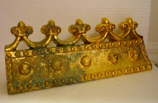
altarpiece constructions I was beginning at that time would never be showcased inside the walls of the gallery I programmed.

Though the altarpieces have been exhibited in many venues, including the gallery at a more liberal Evangelical college, the controversy has not subsided. In fact, I was asked to speak about these works for an All Saints Day chapel at that college in 2004. I didn’t think much about this until I sat down to write up the talk, then I realized that the nudity in all the works was going to be problematic for some. I was assured that I could proceed as planned. However, for the next several years I continued to be recognized on campus and in public by students as the guy with the “naked grandmother painting.” That is what you see here.

Admittedly, this work took a little processing for me before I finally decided that the figure of my maternal grandmother needed to be nude so that the work would make sense in the context of the entire series. No one in my family has ever seen this work; it would be upsetting for some of them. I finally decided to place it online because most in my family don’t follow this blog all that closely. My grandmother had already passed away by the time I began work on this image and, obviously, I did not use her body as the model for the work—each figure is pieced together from multiple sources. However, like all the figures from this series, she is being revered through the altarpiece format. My grandmother was supportive of my early artistic endeavors and used to tell me that she wanted to find her old chalk pastels in the attic for me to use—thus the reliquary items.

Back to the college where I gave the All Saints talk. A couple years later I exhibited the altarpieces on campus. Soon after that some friends in the alumni and public relations office asked if they could use an image of one of the pieces for the alumni magazine. It looked very nice within the pages, but several months later, when the followup issue came out, I realized that the display of nudity had not gone by unnoticed. There was a letter to the editor complaining about the use of the image, along with a well reasoned response. I believe this was the only time that my work has been referred to as “art”—and it was art in quotations, so the objecting party did not believe it actually was.

The same thing happened with another Christian-based publication this past year. The editors at Ruminate magazine invited me to have some altarpiece images published within their pages. Several months later I came across the online response to a similar letter questioning the use of the nude figure in these works. I have actually explained my use of the nude in various postings on this blog (The Affliction of Job: Hope for the Battered and Bruised, And why are those people naked…?). I realize that my reasonings will certainly not be adequate for some who will see the work as inappropriate, but I’m used to being seen as controversial by now. There are actually topics tackled within my work that are far more controversial in this world than a nude body.


Ultimately, I never create work to satisfy anyone but myself. I know there will be people who do not like specific works for various reasons. Usually this is a surface reaction made by someone who is not willing to take the time and energy to wrestle with the work and discover a connection or observation he or she never before considered. The best art is never tame and the quirks in my work are an attempt to make the best art that I can.

Tuesday, September 8, 2009

Art: Not Just for the Fun of It Anymore

The romanticized concept of the isolated artist, misunderstood by society and toiling away during fits of creative ecstasy and inspiration, has been equally damaging for both our broader society and artists. I have often had conversations with students concerning this misrepresentation of the life of the artist. Their preconceptions frequently provide a seemingly satisfactory scapegoat when a given project for a class is either stalled or unfinished at the time of critique. The excuse comes in the form of blaming the muse—i.e. they didn’t “feel like” creating at that particular time; there was no inspiration.

Art school provides a slap in the face to some, or at least a wake up call. The making of art is like the other things people go to college to study—it is work. Being an artist is like being an accountant, a doctor, or a lawyer. It is a job and you do it even when you don’t “feel like it.” Once the convenience of that excuse is gone an artist can finally get on to business. The hard work, day after day, starts to reveal that real art is serious and not just for the fun of it, not just for the enjoyment of the art maker.

This always leads to the next logical conversation with my students. At this point they question my authenticity as an artist. “Don’t you enjoy making art? Isn’t it fun for you to make it?” Evidently, that is why one wants to be an artist—it is fun. I have to explain that it is work. And while I can’t possibly conceive of another vocation that would ultimately bring me the same kind of satisfaction, the making of art does not always provide hours of pleasure, or fun. There are some boring and tedious tasks that must be performed. Sometimes the work leads you into modes of working that are not “fun” but are essential for a body of work to be completed. Such was the case when my work shifted style when I was in graduate school. And this is the example I always share.

I never lacked an intense work ethic as an undergraduate student. I was an overachiever and was constantly working on my own side projects in addition to the ones assigned for my classes. When I settled on painting as my area of emphasis it was, in part, because I really enjoyed the process. Painting was a natural fit for me. During that period I was painting in a more pre-expressionist or post-impressionist system. These terms really only pertain to paint application. The color was mixed on the palette and applied fairly thickly to the canvas without much blending after that. It was a use of “juicy” paint, as my painting professor always stated. I love to paint this way and if I am painting just to paint, with no preconceived objective except to paint the object, person, or scene before me, then this is how I paint.

In graduate school my paintings eventually were composed of multiple segments instead of single canvas images. The first few remained life sized, but then they all shrank to small canvas panels. (Some of these images can now be seen on my website) When this happened I ran into a problem. The smaller scale prohibited me from painting in that beloved style. Instead, I began painting with a more traditional glazing technique. The technique isn’t nearly as immediate and it provides me less instantaneous pleasure, but it was necessary for this type of work.

Those segmented works were difficult to hang on a wall and I soon realized that they were somewhat impractical to continue, even though I liked the effect. At the same time, I decided that the varying depths could be extended by going deeper into the wall space. I achieved that by framing the works and creating a backing or “wall” within that framed space. All this construction was so far afield of “painting” in the more traditional sense. I liked the end results but some of the points in between brought me less pleasure. They were the sacrifices made for the sake of the work.

My students can start to comprehend at this point. Like most things in life, you have to go through some unpleasant portions to get to the best parts. Otherwise there is no way to tell the difference between the two.

From the segmented works my progression soon turned to the altarpiece constructions. This has provided a better example of what I am trying to relay to students and others. It takes years to complete these works. I had to teach myself techniques in woodworking and antiquing and aging objects. The actual painting is a minimal part of the whole process. The box constructions go through several distinct stages and the processes are extremely tedious, though essential for the intended end result. But there is that end result. Though style may changes over time, I feel like I am in the place I am supposed to be with these constructions. Their completion brings great satisfaction, as does the way things are uncovered in the process of making them. They aren’t fun, but they are achieving the things that make the vocation of artist worthwhile.

Monday, August 31, 2009

The Blessings of Self-Imposed Restrictions

In an era when freedom of expression is valued above many otherwise essential things, the notion of limits and parameters in art can be considered taboo subjects. This seems illogical since the very existence of limits is what leads to creative solutions. If there are no boundaries to bend then there is little need for innovation. I have often found that working within certain parameters--whether self-imposed or external restrictions--allows me to seek solutions I would not have otherwise imagined.

This type of limitation is what led to my first experiments with watercolor on antique book pages. I had already been painting with oils on book pages (covered with clear acrylic medium) as part of my altarpiece constructions. To paint directly on the pages was intimidating. There wasn't much margin for error on these fragile pieces of paper.

Here was the circumstance. While I was teaching in Idaho I spent three years as the director of the campus galleries. The region is quite conservative overall and the climate of that campus was even more so. After a bit of on-campus political jostling, I was fittingly fatigued as to seek no further battle over the appropriateness of displays of nude artwork within the galleries. The problem was, when my solo faculty exhibition came around, I simply had no new work that could suitably be exhibited in the galleries.

My solution was to create an entirely new body of work--in the span of three months. The exhibit referenced a bifurcation that I was feeling. I decided that I wanted to continue the work on book pages, and that I would attempt it through a more spontaneous method with watercolor. With such a small annual budget there was certainly no way I could justify using gallery funds to frame the show. I wasn't about to foot the bill myself, either.

That is when I decided that this provided an excellent opportunity to push the boundaries of the region's conservative gallery-going public in another direction. These galleries had never hosted anything remotely like an installation. I devised an installation that would still be comprised of fairly traditional painting. Representational painting.

No work was hung on the walls themselves. In fact, a good two thirds or more of the gallery space was not utilized at all. Instead, muslin fabric was hung from ceiling to floor in the central interior of the gallery. The individual book pages incorporating watercolor self portraits were floated on the fabric, adhered with linen tape. The fabric walls billowed in the breeze created when viewers walked through. One side of the narrow corridor consisted of images on pages with Hebrew text, the other with images on Greek text.

I tend not to divulge the full meaning of this show. It represented a deeper analysis than a mere critique of censorship of the most mild forms of nudity in art. The simple fact that the full impact of the installation was lost on large segments of the viewing public was part of the point. Attitudes and understandings of contemporary art were at the core of this show.

The most unusual piece in the exhibit was also a self portrait, but it observed a different set of limitations. Like the portraits on texts from two languages, this double self portrait referenced the same bifurcation. The piece is completely composed of my old, cast-off clothing. The backing panel of this quilt-like object is white undershirts. The two portrait busts are formed, on one side, from cloth in solid colors, and on the other side, in plaids. The intimacy of clothing--something alluding to both our physical bodies and personalities--is most fitting for a self portrait. The hand-sewn panel was like a physical proxy of the artist within the exhibit.

It is highly unlikely that I would have ever chosen to turn my old clothing into a work of art had an obstacle not been placed in my path. Once the medium presented itself I had to develop my own set of limitations so that the work made sense within the context of the larger show. This is what art continues to be: innovative reimaginings of the elements and materials of design to express some of the same age-old questions that still need asking.

Monday, August 17, 2009

How to Make a Spectacle of Yourself

There was an instance when I was in high school when I skipped classes for a day. I acknowledge it as an instance because it was not a common occurrence and I was always the type to strictly follow the rules. I had an orthodontic appointment early in the day and just didn’t want to return to school. I stopped by my mother’s kindergarten classroom on my way and actually asked permission. When she was satisfied with my answer, that there were no tests or pressing assignments, I was allowed to skip.

So what does a teenage kid do when skipping school? Head to the mall—the temple of American Consumerism. The purchase I made that day caused a certain amount of tension within my family unit. I had purchased a pair of non-prescription glasses. The rest of my family has to wear glasses. I, however, chose to wear them, more like a fashion accessory. "Why," they demanded, "would anyone choose to wear glasses if they didn’t have to?"

I only wore the glasses intermittently over a period of about three years. The taunts from the rest of the family persisted long after. "You’ll be sorry. One day you’ll have to wear glasses." I was constantly reminded that, "When I was your age I had perfect eyesight, too. Just you wait." I still have perfect vision as time marches on. They still have to keep getting their prescriptions changed once or twice a year.

The further torment for them will be when the assemblage/altarpieces with antique spectacles reach points of completion. Maybe the laws of God and nature will have caught up with me by then, but I doubt it. Accumulations of wire rimmed spectacles might suggest a slight mockery of their degenerating sight, but I have better reasons to use them than that.

The proposed accumulations are somewhat reminiscent of the assemblage work of Nouveau Realiste artist Arman. He was part of the French equivalent of Pop art. Arman is best known for his accumulations of identical objects. I don’t recall if I’ve ever seen a piece of his incorporating eye glasses. I do acknowledge that my use of these will bring, to some, associations of Jewish Holocaust photos. There are several historic images of piles of discarded glasses, shoes, and other personal items of victims of that genocide. I assure you, this is not my goal.

The mass accumulations of objects more forcibly assert the presence of the object. The viewer then is confronted with the importance of that object within the assemblage. Because my constructions contain additional objects, text, and painted passages, connections among the disparate elements need to be made by the viewer.

Glasses are worn to help us see more clearly. They help us, literally, to focus. While many people wear glasses to correct general vision problems, others are known to wear "reading glasses." For this very reason, there remains the unconscious—though sometimes openly stated—stereotype that people with glasses are bookish and somehow smarter. Of course, the derogatory concept is that those with glasses are "nerdy."

In the instances where I have chosen to incorporate eyeglasses and other lenses (magnifying glasses, cameras, movie cameras, Viewmaster viewers, etc.) the viewer needs to pay closer attention. More "reading" needs to be done. Perhaps that reading is part of what is being regarded within the piece as a whole. It is a signal as to how the viewer should approach all the works, not just the ones with the lenses. To understand—to enjoy the work—is to interpret it, to read it.

Tuesday, July 28, 2009

Interactivity: The Give and Take of Artwork

My major attraction to the work of Joseph Cornell is the potential for interactivity within the pieces. The book Joseph Cornell: Shadowplay...Eterniday(Hartigan, 2003) includes an interactive DVD that serves as the next best thing to actually handling the works themselves. Video clips show the moveable parts working as the artist intended. Aside from a few major collectors and conservators, most people never get to see this in person.

Once I discovered it, the work of Cornell only reinforced some of my natural tendencies. My childhood was marked by intense creative endeavors that I never acknowledged as "artistic" until I was in college. These creations were not "art" in the traditional sense, so I discounted them until I could comprehend their place within my art making.

As a child I tended to construct devices to enhance play. For instance, there was a period during the time that Lynda Carter starred as TV’s Wonder Woman (as campy as it was) when my two younger female cousins and I would always play Wonder Woman when we got together. My lack of foresight ensured that I would always be the villain and never the hero. I fashioned aluminum foil into star studded Amazon headbands and bracelets for them. We even utilized some of that gold cord used for gift wrapping as the magic lasso. I know, this isn’t overly creative, but this was just the beginning.

This was in the early 1980s and well before every household had its own computer. One of the most memorable items was an ID scanner made from paper and cellophane tape. My maternal grandmother worked at State Farm and she always had an abundance of some oddly sized, perforated paper that evidently had some function within the insurance industry. I usually just drew on it in church. The ID scanner—again, long before we were all accustomed to debit card swipers and PIN codes—was amazingly functional.

It consisted of a small box that was taped next to a bedroom doorframe. There was a slot in the front where our ID cards were inserted to gain access to our top secret offices. This was not just a hole cut in the face of the box; it was a slim interior compartment that only allowed the cards to be inserted a certain distance, so they wouldn’t get stuck inside. On the top surface was a keypad with dimensional keys that could actually be depressed into the main box. All in all, it was fairly advanced for a paper and tape device that mimicked something we, as a general public, had only seen on TV programs with futuristic plotlines.

In the years just after the ID scanner I moved on to bigger and sturdier objects. There was a cardboard computer panel with multiple screens and keyboards. This was colorfully painted in poster paint and could be conveniently folded up for under the bed storage. The computer panel was accompanied by a red convertible sports car. It was just a profile view—kind of like those character screens at amusement parks with holes for people to poke their faces through for photographs. But the door functioned and I think the steering wheel did too, somehow. I know we had fun with the contraptions, though they are now compost.

I wouldn’t want anyone to have saved one of these things to hang on the wall in her home. Once I started to paint in high school I gave away several sad little canvases to family members, and those are things that I also wish would no longer hang on my relatives’ walls. All of these things, spanning about an eight year period, make up my early unconscious strivings to become an artist.

The painting was officially sanctioned art and the odd constructions were the early stages of viewer participation. Just as text and images are two connected sides within my current work, paintings and interactive constructions are another pairing. This came about quite subtly, but it was always there.

The pop sculptor Claes Oldenburg had a famous quote, in his 1961 manifesto, about how he felt art should function:

I am for an art that is political—erotical—mystical, that does something other than sit on its ass in a museum.
I am for an art that grows up not knowing that it is art at all…
I am for an art that embroils itself with the everyday crap and still comes out on top.
I am for an art that imitates the human, that is comic, if necessary, or violent, or whatever is necessary.


That is part of what I am about, too. If art is simply going to hang on the wall or sit on a pedestal and look "nice" then I don’t have nearly as much use for it. My paintings require the viewer to not only interact with the images but with the underlying text. If the paintings are part of an assemblage/construction then even greater interactivity confronts the viewer. The element of play is once again present.

Part of this may stem from my slight aversion to Modernism’s pure aesthetic aims. There has only been a brief period of time when art for art’s sake was seen as valid. For most of human history what we now term as "art" had a function outside of pure aesthetic contemplation (Nicholas Wolterstorff’s Art in Action gives an outstanding analysis of this). I respect and acknowledge the significance of multitude forms of modern and contemporary art. What I desire for my own work is to have viewers physically, mentally, psychologically, and spiritually interacting with it. I want the work to meet the viewer halfway, expecting something in return, but meeting the viewer wherever he or she is at in a given moment in life.